Frequently Asked Questions about Squarespace templates
Can I change my template? How can I try out a different template? What's the best way to choose a template?
You can change templates at any time. In fact, when you first start out, you should probably try out a few templates before committing to one. I suggest putting some of your real-life content into whatever template you start with, and then switching to a couple of different ones to see how another template might work with your content, before you firm up your final choice. In other words: don't spend ages perfecting the exact font size and colour on the first template you try. You are better off installing 2-3 different templates and seeing broadly how they work, and THEN spend the time on fonts and whatnot once you are happy with the overall look and performance of your final selected template.
Which template is best for my website? It is a [ blog / photography / e-commerce / whatever ] site.
There are too many variables to give an answer to this without knowing more about you, your audience, your business, your content, your brand... you get the idea. Every person's preferences and business needs are different - otherwise we'd all have websites that look exactly the same.
Squarespace have made a stab at categorising templates in their template browser, and you can see some general tips in the detailed analyses linked from my comparison chart, but the fact is that any Squarespace template could be used for any type of website in the right circumstances. However, the lovely and talented Rasmus Schuebel has put together his recommendations for templates in this downloadable graphic chart so you might find the last column there a good starting place.
The choice of template is about how you want your pages to look, not what's in them. Templates affect the aesthetic styling, not the content, and not the functions. Many people find it difficult to distinguish these.
- Template = look & feel (colours, fonts, textures, positioning)
- Content = the words, images, videos and files you put into the site
- Functions = actions / page types (blog, gallery, e-commerce store, contact form)
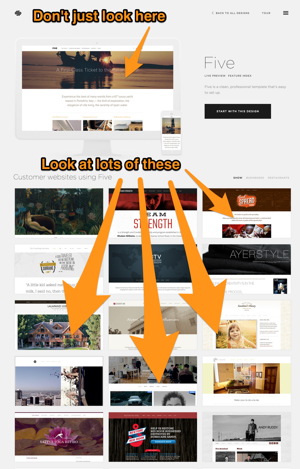
So the best advice when choosing a template is to have a look at the different demo sites on the Squarespace template browser AND to look at the example sites from real-life customers that appear below the template demo (see image further down this page) to see how the functions that you want to use look in that template. And read on...
I need a template that has a photo gallery / videos / online shop / blog / newsletter signup / downloadable PDFs. Which one has that?
All of the templates offer all of these core Squarespace functions, so the template you choose won't impact your ability to have these. As mentioned in the previous answer, any template could be used for any type of website... although some templates have certain features that will make it easier/better/more attractive for certain functions.
For example, all templates have a blog, but not all templates have sidebars. So, if you want to display something such as a category list or tag cloud in a sidebar on every blog post, you should choose a template that has a sidebar. But if that doesn't matter to you, then you could use any template for your blog.
All templates have integrated e-commerce, but some templates do special things like displaying the products in a different way, or making the photo of the product into a banner image at the top of the screen. All templates have photo galleries, but some templates do fancy things with them, like showing them in a full-screen slideshow or a horizontal scroller.
So the best thing to do is to have a look at the comparison chart and look at the different template demo sites to see how that template displays those features. If the demo site doesn't show the feature you're looking for, flick through some of the example sites that are shown below the template (see image below).
All the templates look the same: white background, black text. BORING! None of them look anything like what I want. I'm ready to give up.
Squarespace have taken a 'blank canvas' approach to designs on their templates. Unlike WordPress and some other web builders, there are no pre-baked colours, textures or fancy fonts to distract you. This means the overall structure of the template can shine through. It's up to you to apply colours, change sizes or include background images to make the template your own. Think of it like this: the template is like the overall structure of your house; it's then up to you to apply the paint & furnishings.
The best way to see the potential of a template is to flick through some of the example sites that come with each template, as shown here:
Squarespace example sites for the Five template: just look at all the variations that are possible!
If you're thinking about switching to WordPress because you think the designs are 'better' or 'easier' then you may find this blog post useful reading: Squarespace or WordPress - which is better for design?
Don't forget to visit the All About Squarespace Templates page on this site, too (if you haven't already).
